While the entire feature is chock-full of useful contrasts and figures (check particularly the anti-Muslim hate crimes rate, and how it remained relatively constant at around 30/a until September 11, 2001 and then jumped to just under 500, falling back only partway), this one in particular jumped out at me:
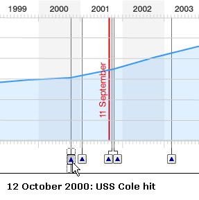
This image is a close-up of the chart showing defence spending, and where it upticks. Note that it climbed first after the USS Cole bombing, but also note that it has continued a smooth upward climb ever since.
In any case, please go check it out. Draw your own conclusions, make your own comparisons, and see the data for yourself.
No comments:
Post a Comment